This week’s Evolution 101 blog post is by MSU postdoc Arend Hintze and MSU graduate student Randy Olson.
While fitness landscapes are generally thought to be more of a theoretical construct, they are in fact quite tangible and underly every evolutionary process that we know of. Unfortunately, fitness landscapes are often difficult to visualize, and in many cases in biology it is unclear what they actually look like. But don’t worry, I am going to talk you through it.
As a first step, imagine what a genotype looks like. For biologists, a genotype can be composed of nucleotides and look like:
ACGCGCTCATATGACA…
Since we are also computational scientists, genotypes can also be represented with numbers, such as:
0.9 0.1 0.1 0.4
If you are familiar with Avida, a genotype could be a sequence of program instructions and look like this:
fczczcczrucanqqqpqpqppjcovv
Whichever way the genotype is represented, each genotype encodes a phenotype, and each phenotype is assigned a fitness value depending on how well it performs. In biology, we count the mean number of offspring (fecundity) and assign that as the phenotype’s fitness, whereas in computational simulations we either use fecundity or assign another numerical value indicating how well the phenotype performs. (For example, how far a robot walks before falling down.) Regardless of the system, this fitness value, W, will always determine the mean number of offspring that the phenotype produces. This means that each genotype is associated with exactly one fitness value. In reality, the mapping between genotype and phenotype is not so straight forward, and depends on several factors, but we will keep things simple for now.
Imagine the first genotype again (ACGCG…), and imagine a mutation being applied to it. If we only consider point mutations, each possible site will have three alternatives (e.g., A can mutate to T, C, or G), and each of these alternatives will have a new fitness value associated with it. Since each mutated genotype experiences only one mutation, we say that all of the mutated genotypes with one mutation have a mutational distance of one from the original genotype. The more the genotype is mutated, the further the mutational distance between the mutated genotype and original genotype. If we enumerate every possible genotype (and every genotype has its own fitness value), we can start drawing a fitness landscape, where the height of the landscape is defined by the fitness, and the place on the map is defined by the mutational distance from the original genotype.
You might have spotted the issue with this method of creating fitness landscapes: while such a landscape grows nicely, it only has two dimensions, with the third dimension representing the fitness value. In reality, fitness landscapes are highly dimensional and impossible to visualize; however, the two-dimensional space we defined suffices as a simple, low-dimensional representation of the landscape. Thusly defined, an entire fitness landscape might look like this:
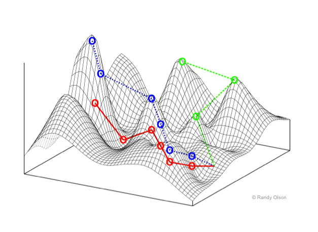
There are peaks and valleys, and by examining this landscape you can imagine the direction a genotype may evolve. Every time the genotype mutates, it alters its location in the landscape a little, and experiences the fitness value assigned to its new genotype. The higher the fitness value, the better the genotype performs, and the more likely it will create offspring into the next generation. By continuing this process over many generations, the genotype will eventually end up on a peak in the landscape. If mutations allow the genotype to make large steps across the landscape (e.g., more than one point mutation per generation), it could cross valleys easier (blue and green trajectory), or discover a different path entirely that leads to the genotype encoding with the highest possible fitness value (red trajectory). The shape of the landscape and how far mutations can move the genotype across it will determine the evolutionary path and the final peak the genotype will end up at.
One nice way of visualizing fitness landscapes is with Luis Zaman’s hands-on simulation of “finger painting” fitness landscapes, which can be found here: http://www.cse.msu.edu/~zamanlui/processingJS/draw_fitness/
The paper about the finger painting landscapes simulation can be found here: http://mitpress.mit.edu/books/chapters/Alife13/978-0-262-31050-5-ch065.pdf
